

Toller: Concept Project*
Role:
UX/UI Design, Brand Design, Squarespace Developer
Year:
2024
The Brief
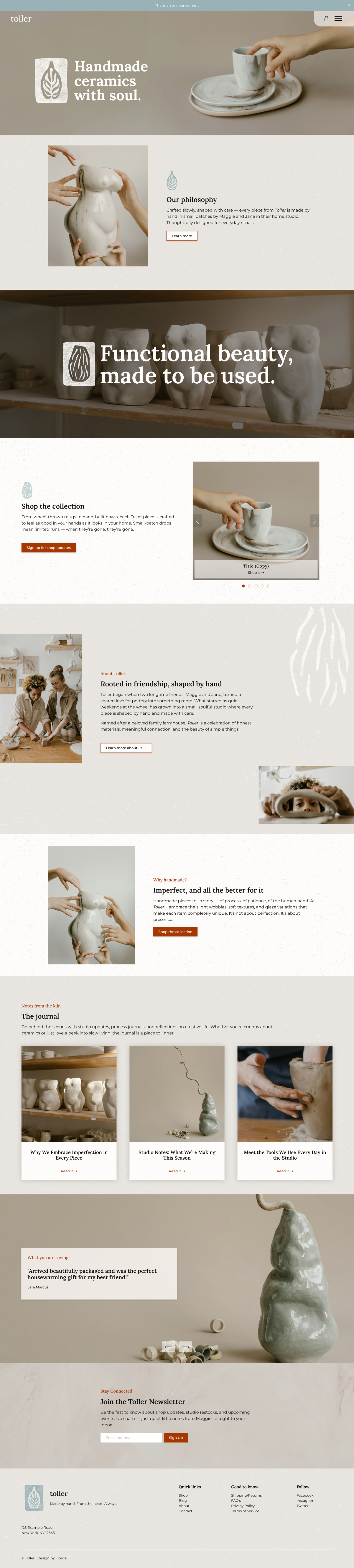
For this portfolio project, I set out to design a concept website for Toller, a fictional small-batch ceramics studio founded by Maggie and Jane. The challenge was to create an online home that balances e-commerce functionality with rich storytelling, reflecting the earthy, tactile qualities of their work.
The Story
Toller is the soulful ceramics brand of Maggie and Jane, a creative duo crafting each wheel-thrown and hand-built piece with intentionality and care. They needed a quiet, soulful website that would not only showcase and sell their limited-edition pieces but also invite visitors into the warmth of their friendship-driven studio practice.
Competitor & Industry Research
Research & Brand Insight
I researched the handmade pottery and slow-living niche to pinpoint brand opportunities. I looked at:
E-commerce patterns used by independent makers vs. larger retailers
How studios integrate storytelling alongside products
Accessibility considerations, especially around color contrast, typography, and product states
The emotional language used in brand voice and photography
This research helped me identify gaps: many maker sites either leaned heavily on story but neglected usability, or were purely transactional and lost the warmth of the handmade process. My goal was to design a balance between the two.
Key take-away’s:
Authenticity matters: Buyers look for real stories: images of hands at the wheel, portraits of makers, and notes from studio life.
Lifestyle context sells: Showcasing ceramics as part of daily rituals (coffee in the morning, family meals, journaling at dusk) helps customers envision using them.
Community builds trust: Customer galleries, behind-the-scenes glimpses, and occasional studio peeks enhance brand connection.

Taking what I’ve learned
The Solution
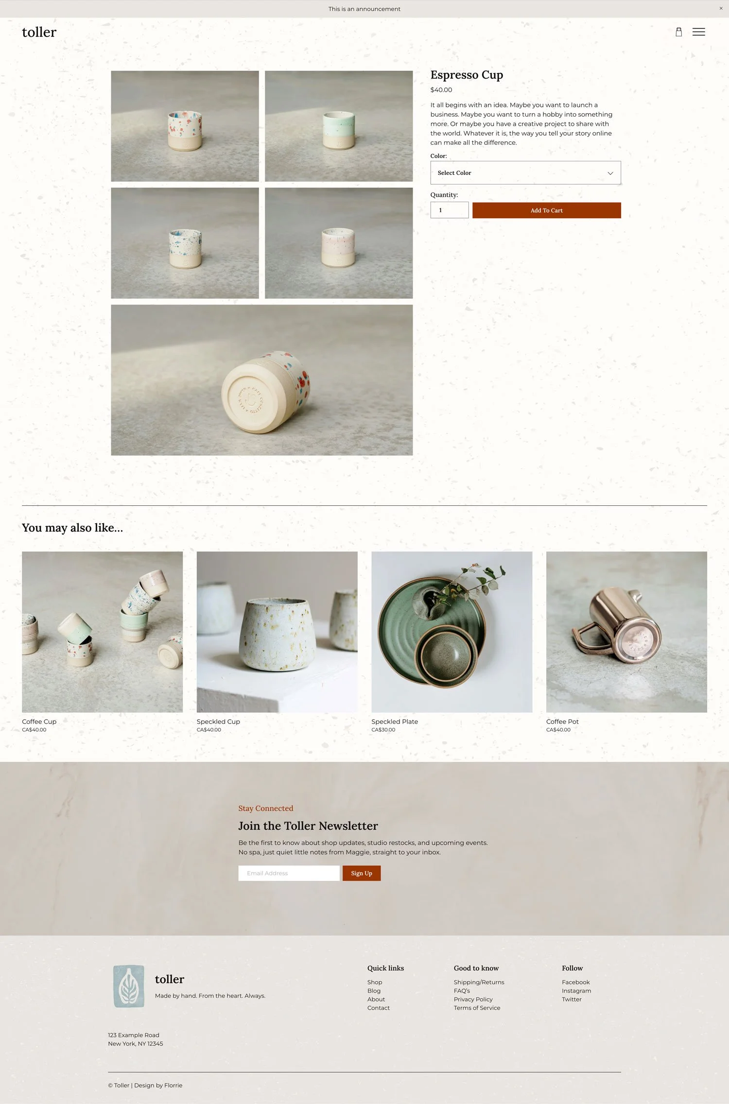
I designed a Squarespace website that combines a clean, emotion-first homepage with intuitive e-commerce features. Visitors are introduced to Toller through Maggie and Jane’s story, before being guided toward the shop. The journal section supports long-term engagement by sharing behind-the-scenes posts, process insights, and product stories.
Key features include:
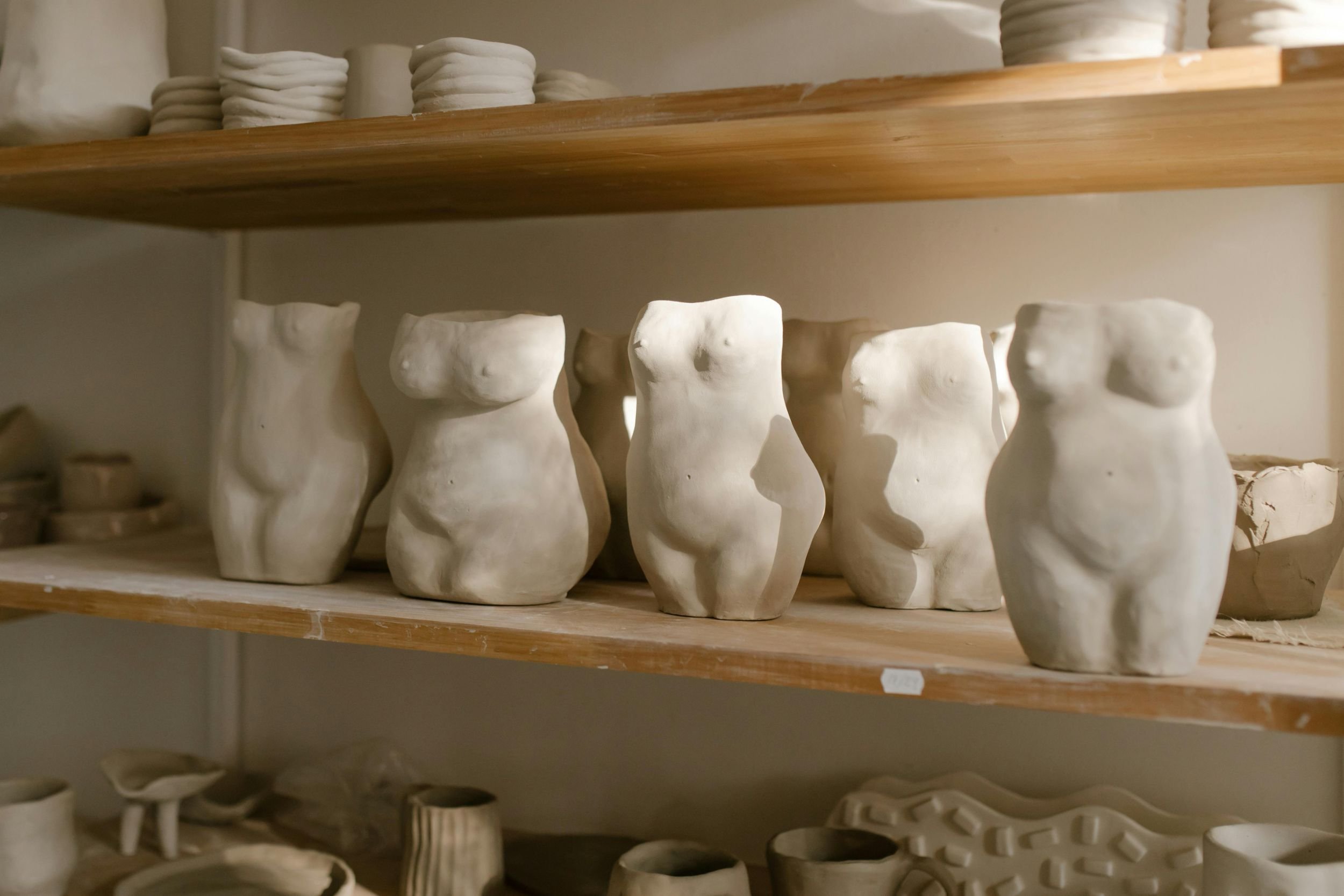
A tactile brand identity; subtle background textures, progress imagery and organic illustrations weave the Toller story throughout the site.
Accessible design choices; ensuring legibility and usability across devices
Subtle animation and micro interactions; creating movement and depth without overwhelming the handmade feel
Scalable content structure; a shop, blog, and newsletter integration to support future growth
Intended Impact
The concept site was designed to:
Provide a user-friendly e-commerce space tailored to a small handmade studio
Put the makers’ story and process at the forefront, building emotional connection with customers
Build trust with clear product information and consistent states (sold out, sales, availability)
Offer a sustainable digital foundation that could easily expand with new collections and marketing needs
Reflection
This project gave me the opportunity to:
Experiment with creating an emotion-first homepage that balances storytelling and sales
Explore GSAP scroll-based animations in a subtle, supportive way
Develop a tactile, earthy brand palette that communicates handmade values
Practice building a complete Squarespace shop flow from browsing to checkout
Although Toller is a concept project, the process mirrors how I approach real client work: combining research, storytelling, design strategy, and technical expertise to create websites that feel both beautiful and functional.
Hello, florrie!
About the designer
I’m Claire, web designer, maker, and the heart behind Florrie Studio. With over 20 years in the handmade world, I get what it’s like to do it all. My approach combines intuitive design, friendly guidance, and strategy rooted in what actually works for creative business owners.
